Some Useful Binding Tips and Ideas
"It's not just what you say; it is how you say it, present it and package it."
In today's increasingly competitive and communicative world, getting your message across has become much more of a challenge.
Binding Tips:
- When you place your document in the punching throat of the machine make sure it is fully in by moving it from side to side, then ensure your document is aligned to the left
- When using a cover and back, place a sheet of paper in between before punching
- When using a Click Bind spine, pinch the first two rings together before using the zip tool
- Make sure all of the pages are aligned before you place the document onto the spine
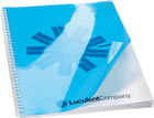
- Prior to inserting the binding spine, place the back cover on the front then once bound rotate the back cover to the reverse so that the spine is completely hidden

Design Tips:
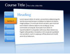
- Create a background for PowerPoint slides and title page based on your company colours and style. If you would like to use the same template again, create a folder on your computer named template and save it there.
- When grouping text and images, the images should be separate and distinct so the audience knows where to focus.
- Use pictures as bullet points. Go to bullets, then select picture, and import.
- Use up-to-date images with a professional look instead of clip art. Many images are available at no charge on the web.
- Using too many arrows on your slides results in clutter and confusion. Try boxing the information together.

Packaging Tips:
- Package your presentation to match the occasion
- 76% of professionals believe a bound presentation gives materials a more professional appearance
- If in doubt, make your presentation more professional than casual. It's always an advantage if you look polished
- Packaging with durable materials will add shelf life to your presentation
- Laminate visual aids to enhance their appearance and give you the ability to display them in the meeting room


